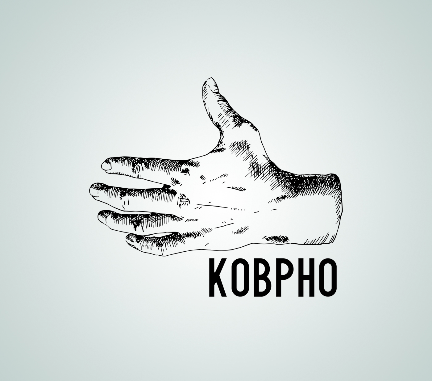
My new logo. My new alias. I wanted something shorter. I wanted something I look at and say “That looks nice!”. I wanted something I would wear on a T-Shirt. So here is my new logo! Why the hand you ask? I looked back at some photos of me where I hold a camera. And in 90% of the pictures my left hand looks like this. So I thought, hey thats unique. The font is really simple. At first I wanted some serif font or maybe some darkage inspired stuff. But I think a bit more modern font will do perfect.
I already registered www.kobpho.com but for now kobe-photography.com will be the main domain as it is. Step by step!

